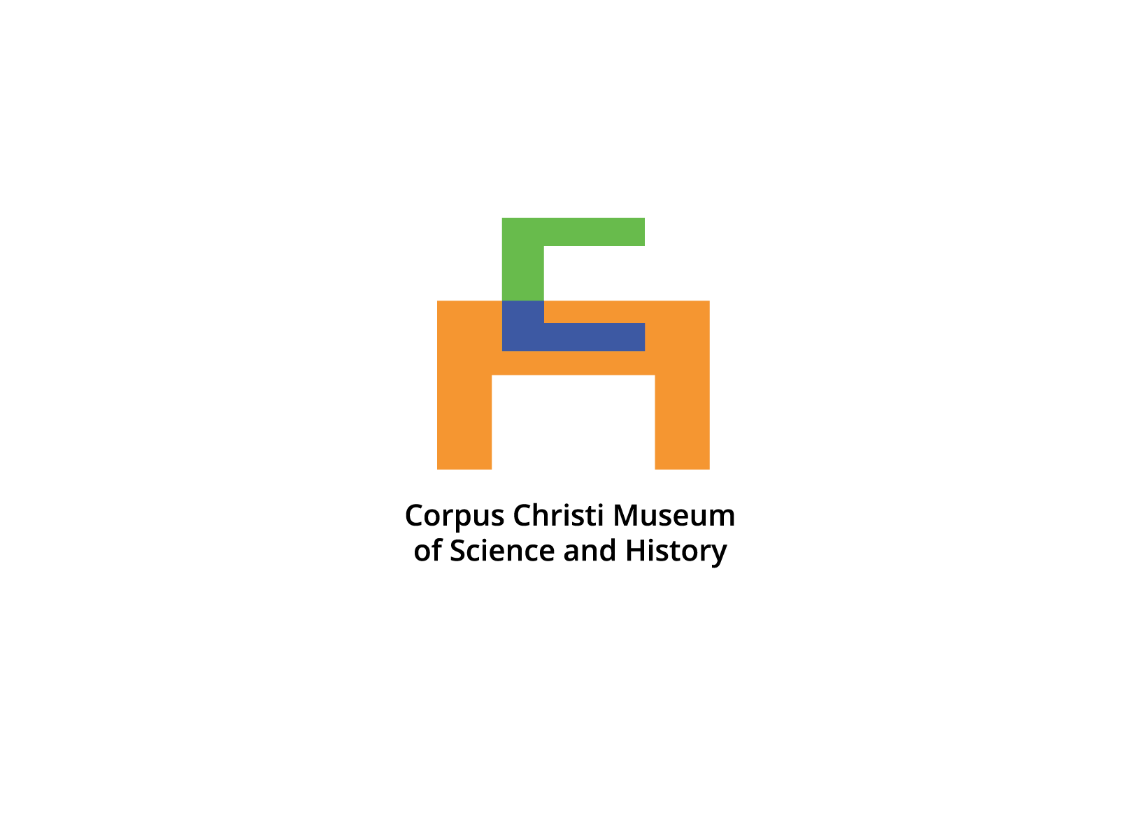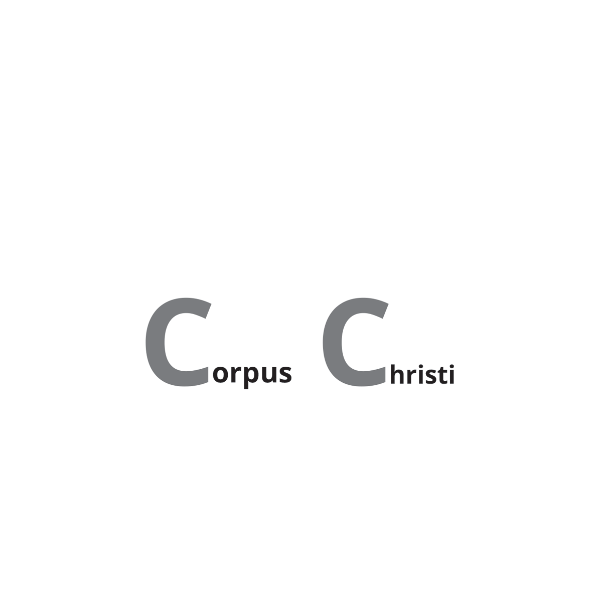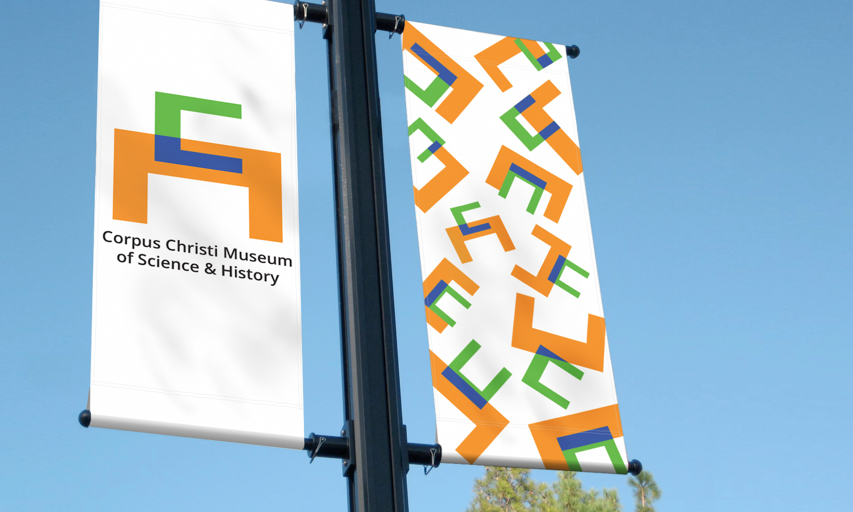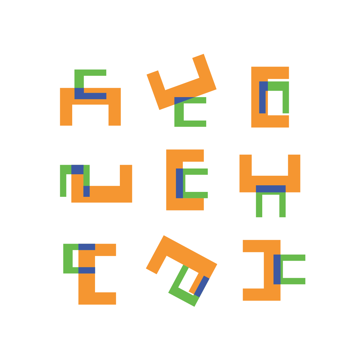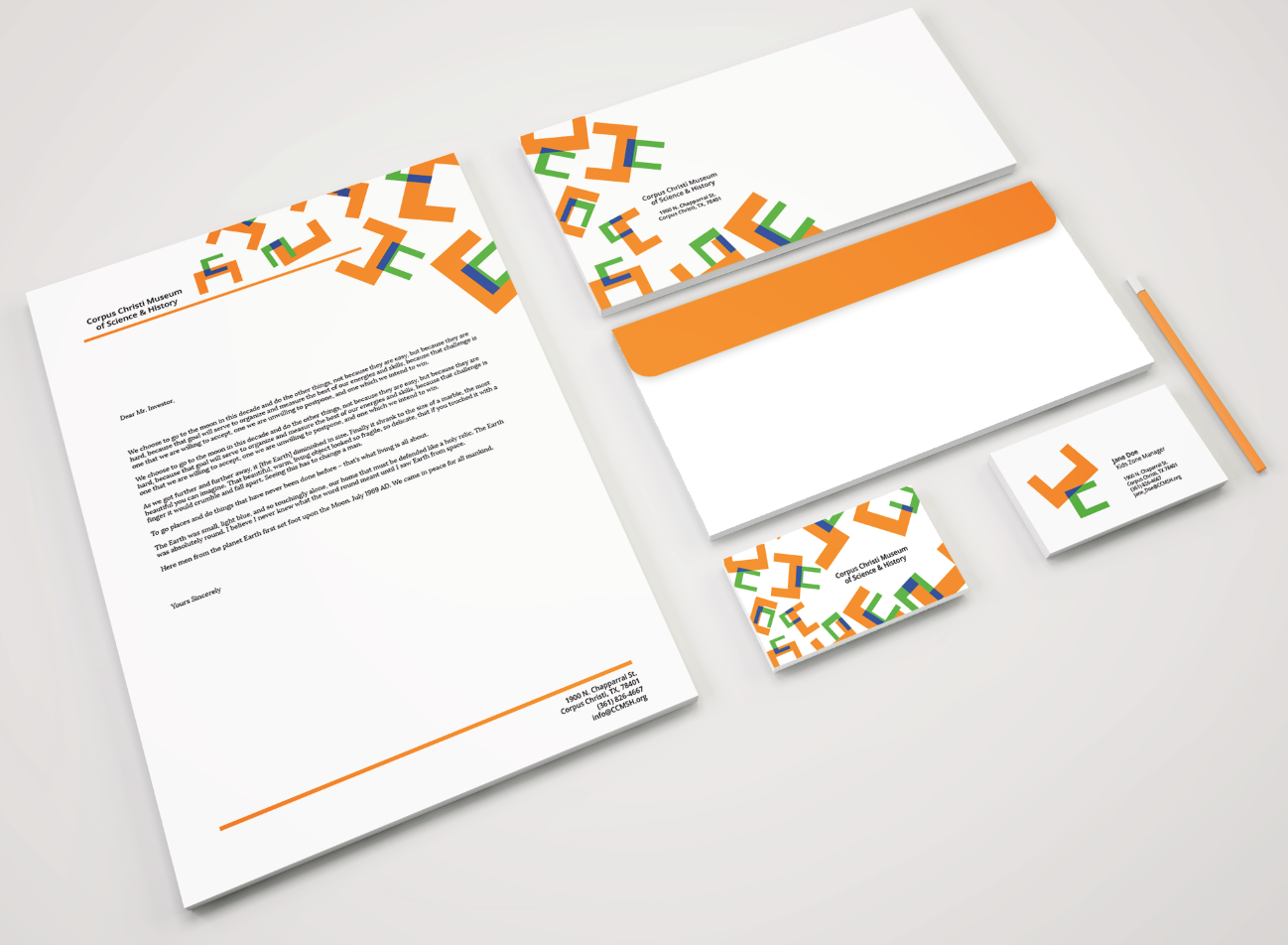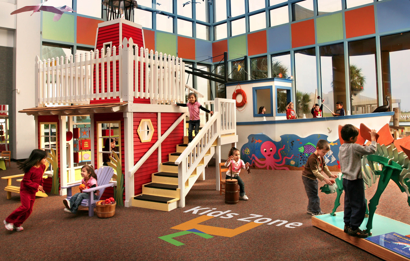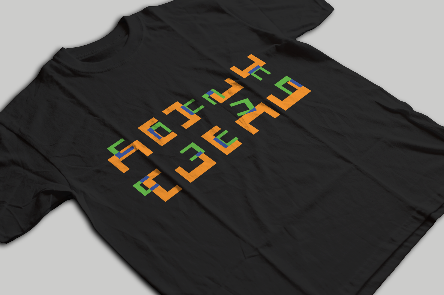
Developed a modern, dynamic identity system for the museum designed to engage diverse audiences and seamlessly adapt to rotating exhibits. The logo concept geometricizes the double "C" of the city's name, intersecting the letterforms to evoke a contemporary, scientific feel. The vibrant green and orange palette directly mirrors the museum’s architectural exterior, with a custom blue emerging from the geometric overlap. This highly adaptable visual framework scales fluidly across stationery, apparel, and large-scale environmental banners.